When a designer works on a site, there is an obvious desire to get people to view the site and interact with it. Why else create it? So a designer must presented users with a logical and manageable site that a user can find his/her way around. If a user gets frustrated by getting lost or becoming confused by the site, that user will search the rest of the billions of sites that exist by pointing a browser at a search engine.
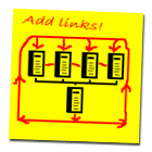
Frustration is a fairly common event on the Internet, especially within sites that are ill-conceived. To prevent frustration, the creation of clear navigational aids are helpful. Lynch & Horton (2001) recommend leaving links on pages that point to the homepage. They also suggest placing links to other pages and sections, too. Their proposed system creates a network of interconnected pages.
When web pages are interconnected, users can find information easier. If they obtain an undesired section or page, users will feel a sense of confidence that links will be present on future pages to assist their need to poke around. As a designer, it's not a bad idea to create a network of links that invite users to explore. The longer they poke around, the more they may learn in the case of an educational site.
Yet another way to make a site more navigable is to clearly represent links. Both graphic and text links should be clear. When users click on a graphic or text link that says "Gas Laws," users are not expecting a life story of either Boyle, Bernoulli, or Boltzmann. Make link titles match the content of the pages they point toward to rectify this potential problem.