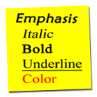
There are a number of methods for creating typographical contrast. Lynch & Horton (2001) outline the benefits and pitfalls of using the following tags:

- Italic
The tag <I> makes text slightly lean to create contrast. Creating large blocks of italicized text is hard to read.
- Bold
The tag <B> makes weighted text that is thicker than normal text. Large blocks of bold text are hard to read.
- Underlined
The tag <U> underlines text. The effect of underlining text is confusing to readers because underlined text usually indicates a link to a differnet page.
- Colored Text
Using colored text attributes within tags is a great way to create contrast on webpages. However, great care must be taken when choosing background and text colors. Color combinations should be pleasing and text should be different than the color of text links to avoid confusion.